Dashboards fill up because adding a metric is easier than justifying one. A useful social media reporting dashboard starts from the decisions it should support and includes only what informs them.
Start from the decision
For every panel, name the decision it could change. If nobody can, remove it. That single rule typically halves a dashboard and makes the remainder considerably easier to read.
Different audiences need different dashboards. The production team needs per-item detail; leadership needs trend and delivery. Trying to serve both in one view produces something that serves neither, and it is usually the leadership view that suffers.
Building it
- List the decisions it should support, first.
- Choose the fewest metrics that inform them.
- Define each metric in writing, including its window.
- Separate paid from organic.
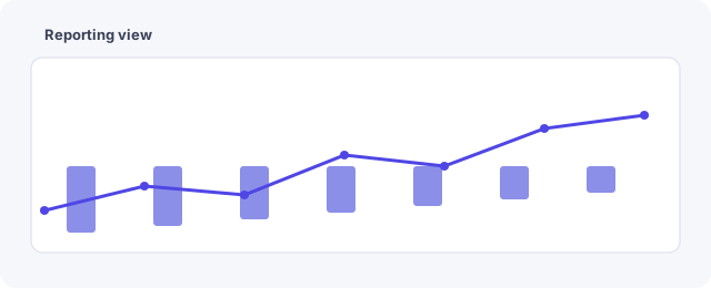
- Show trend over several periods, not a single figure.
- Leave room for written commentary beside the charts.
- Note the refresh date, so nobody reads stale data as current.
Written definitions prevent the recurring argument about what a number means. Two people reading "engagement" frequently mean different things, and the disagreement surfaces at the worst moment.
Commentary beats another chart
A dashboard without interpretation pushes the analysis onto whoever opens it, usually someone with less context. Two sentences beside the chart explaining why a figure moved is worth more than three additional panels.
Beware of dashboards that are checked constantly. Frequent viewing of noisy metrics produces reactions to variation, which is worse than not looking at all. Set a review rhythm and hold it. Report formats sit in the monthly marketing report workflow, and target setting in the KPI planning guide.
Common questions
How many metrics is right?
Usually five to eight per audience. More than that and the important ones stop standing out.
Should it update in real time?
Rarely useful. Real-time social data mostly invites reactions to noise.
Who should own the dashboard?
One person, who can remove panels as well as add them. Dashboards only ever grow without that authority.
Should it replace written reports?
No. A dashboard shows what happened; a report explains it and states what changes.
How often should it be reviewed?
The dashboard design twice a year; the data on whatever rhythm matches the decisions.
What about vanity metrics?
Include them only if they inform something. Follower counts on a dashboard tend to become a target by accident. See the FAQ.
Should the dashboard include annotations?
Mark campaign launches, outages and anything unusual directly on the trend. Unexplained spikes get reinterpreted every time somebody new looks at them.
Should each platform have its own view?
Usually yes, plus one combined trend. Averaging platforms that behave very differently produces a number describing none of them.
Related guides
More on this topic from the same section: